

I recently completed a website for yet another satisfied client who deals in asset based hard money lending for real estate projects. However, this time around, I managed to keep track of enough of the assets along the way to try my hand at a project case study.
As an upfront disclaimer: I will be “naming names” as far as speaking to specific apps and plugins that I used for this project. Although I will be providing links, they are not affiliate links. Therefore, if you follow one and then decide to make a purchase, I won’t get anything out of it.
So, without any further buildup of fanfare, let’s get into it.

Credit: thegifs-queen.tumblr.com
Original Site
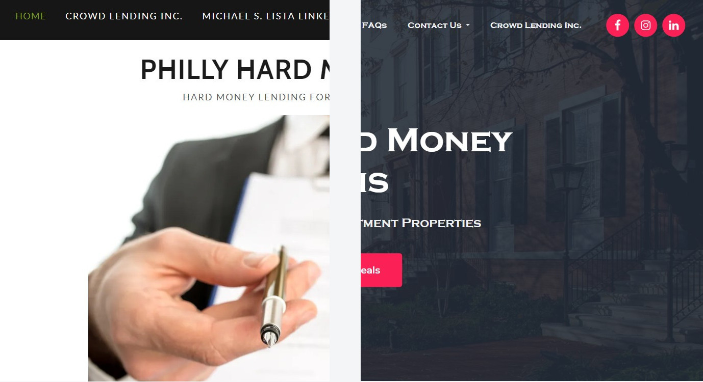
When the client first approached me, he stated that he had a pre-existing site with a popular hosting company and built using their proprietary site builder. Below are the shots of what was initially in place:
-

- Home Page
-

- About Us

-

- Portfolio
Brief
For what the gent had to work with on his own, for my money, he did well for himself. However, he was interested in some extra functionality for his platform that he was struggling to implement. Specifically, below was his wish list for his platform:
- Rank more organically on search engines
- Take more detailed information from visitors seeking general information
- Take proper loan applications from interested parties
- More cleanly tie in his social media platforms
Proposal
After an initial review of his current hosting account and page builder functionality, I explained to the client that the hosting platform that he was on was fine enough. However, the specific account would need to be upgraded to a shared variant so that a full rebuild of his site could take place. With that in place, I would be able to setup with a build in WordPress that would give him more flexibility regarding front-end designs and back-end functionality. Above all, this would provide the client with a space that he could easily manage on his own – with a little training – if he chose to do so.
Below you can see another look at the original site with some of my specific suggestions:
-

- Home Page Notes

-

- About Us Notes
-

- Portfolio Notes
- Home Page Notes
- Replace the overall site design as a whole
- Streamline the top level menu
- Replace the header photo and setup a call to action (CTA)
- Improve the legibility of the copy
- Remove the newsletter opt-in and move the social buttons
- Move the contact form to a dedicated page and have it request more targeted information
- Expand on the footer by adding more information and CTA’s
- About Us Notes
- The only real suggestion I had for this page was to – perhaps -adjust the copy to make it more legible
- Portfolio Notes
- For this page, I conveyed to the client that there were other ways that his latest deals and properties could be displayed that would do him more justice from a design and functionality standpoint.
After a bit of Q&A regarding specifics and compensation schedules, my services were retained an we we’re on our way.
Hosting Space
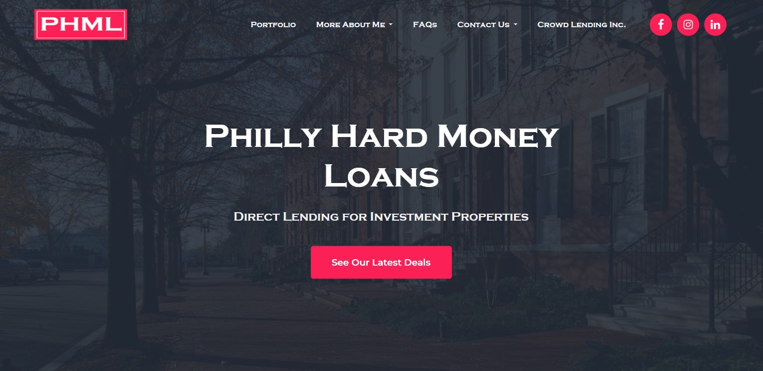
To deal with first things first: The account that the client had that was specifically setup for the proprietary page builder he was working with had to be upgraded. During a three-way call with the support techs at said company, his account was very quietly and effortlessly changed into a shared account with cPanel administration access. Prior to this call, I had taken the full screenshots of his original website that were shown previously. With them in hand, I was able to quickly go in afterwards to setup the site and rebuild it back to where it was, but just a little bit better to start:

Admittedly, the shot above is moreso a view of the homepage in the end than at the very beginning. However, the differences between the two are not that far removed. As you can see above, the layout above hits all of the suggested marks laid out in the proposal, as well as a few extras:
- Mid-page video promo where the client himself tells you more about what he does.
- It gets cut off near the end. In his words, it was done by someone else who wasn’t trying very hard to get it done. As of the time of this writing, I still have plans to get together with him to help him do something more complete.
- Short section showcasing his latest deals with a button leading to his full property portfolio (More on that coming up)
- Simple recent testimonials section showing words from some of his recent clients with another button leading to a more expansive page of his client reviews.
- Pre-footer CTA leading to a contact page where interested parties can easily reach out to him for more information regarding various topics.
Disaster Recovery
One of the first thing I like to do on any of my site projects is to get a backup routine in place. I’ve heard enough horror stories of people losing files and systems to crashed, errors and high-tech espionage to be particular about making sure that my clients have a way back from such catastrophes should they find themselves in similar predicaments. Especially in situations like this where I have a client who site is meant to be a major part of their business, if not the business.
For this – as far as WordPress sites go – my service of choice is UpdraftPlus:
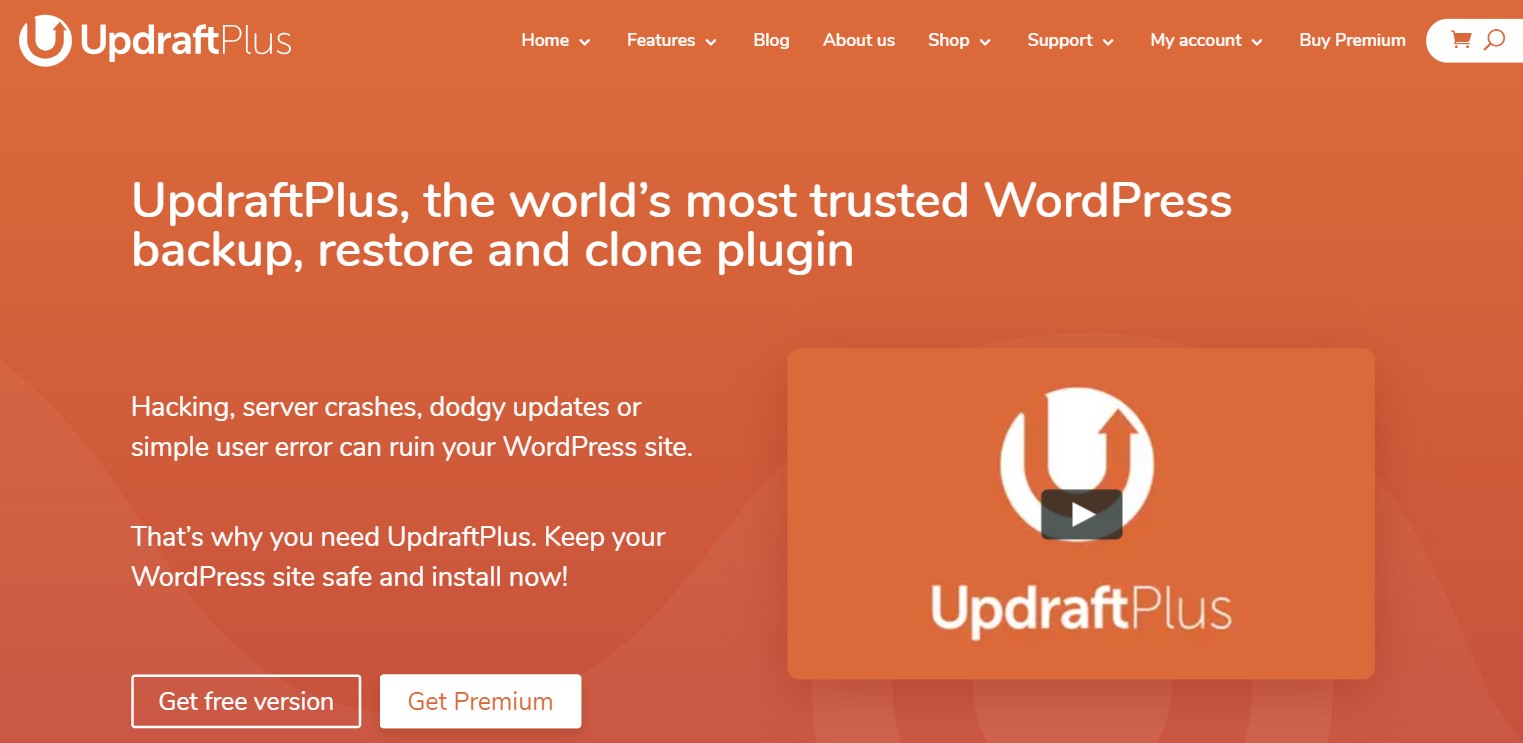
The free version is very straightforward and does one-button-push backups directly to the same space that its base site is sitting on. In addition, the premium version, which I always budget out a license for in proposals, will send those backups to most of the major cloud file services and do so on an automated schedule.
Of those, the one I usually choose for clients, if nothing else is in place, is Dropbox. Its easy to set up a free account and so far, the space provided with that has been enough to hold about 2-3 full versions of a client’s site.
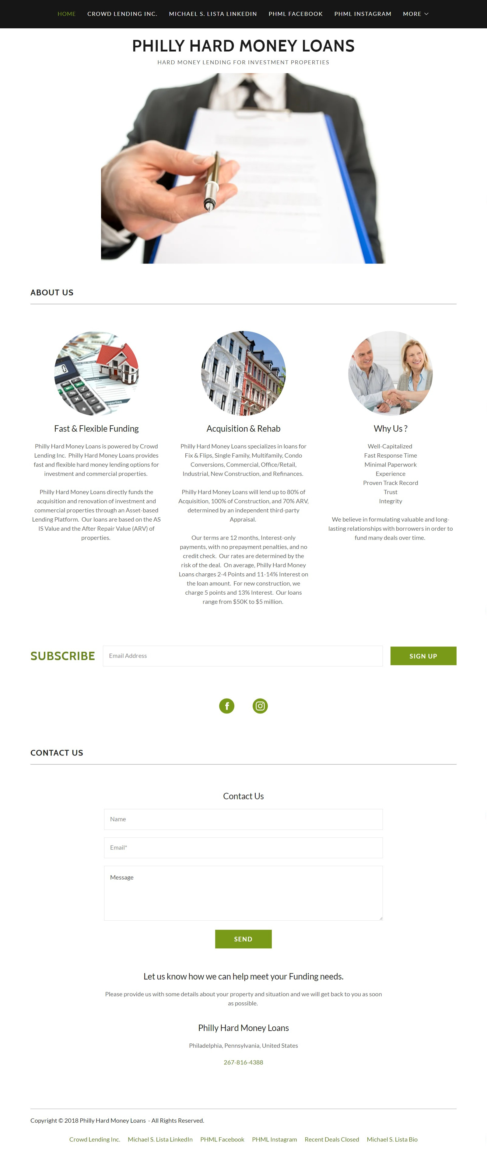
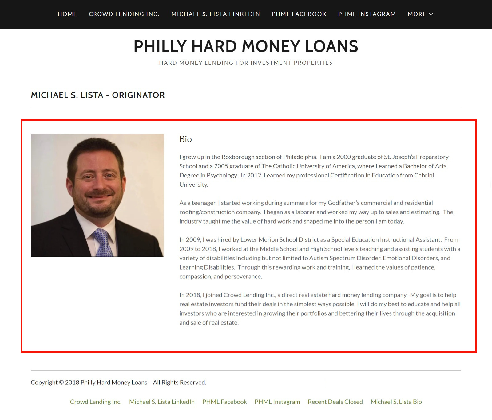
About Us Page
From a content and design perspective: Nothing about this particular page really changed. After conferring with the client on the matter, we agreed that – apart from a font size bump and some subtle effects – nothing about it really needed to change. The new website design – in and of itself – went a long ways to bringing it more to life on its own:

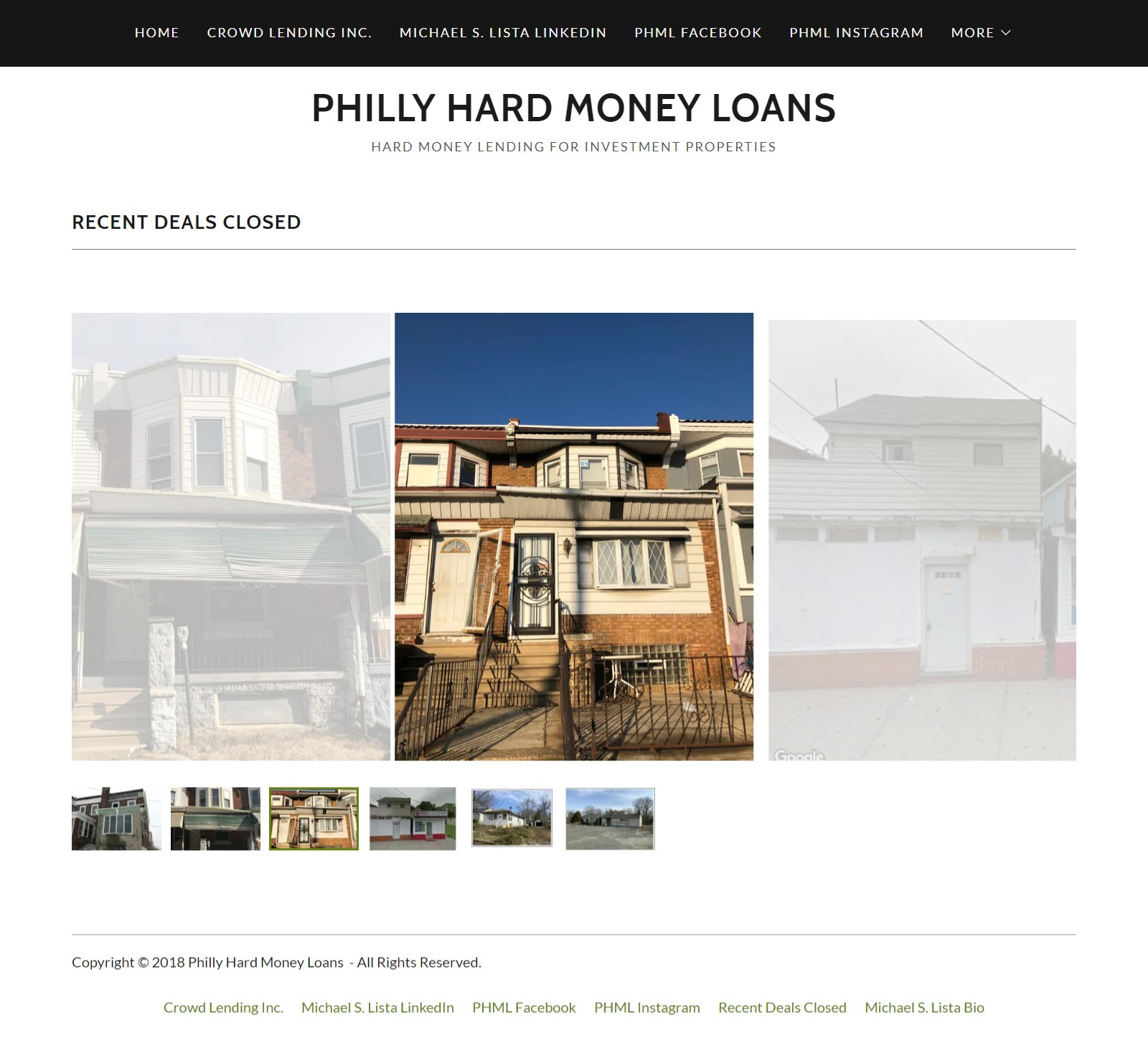
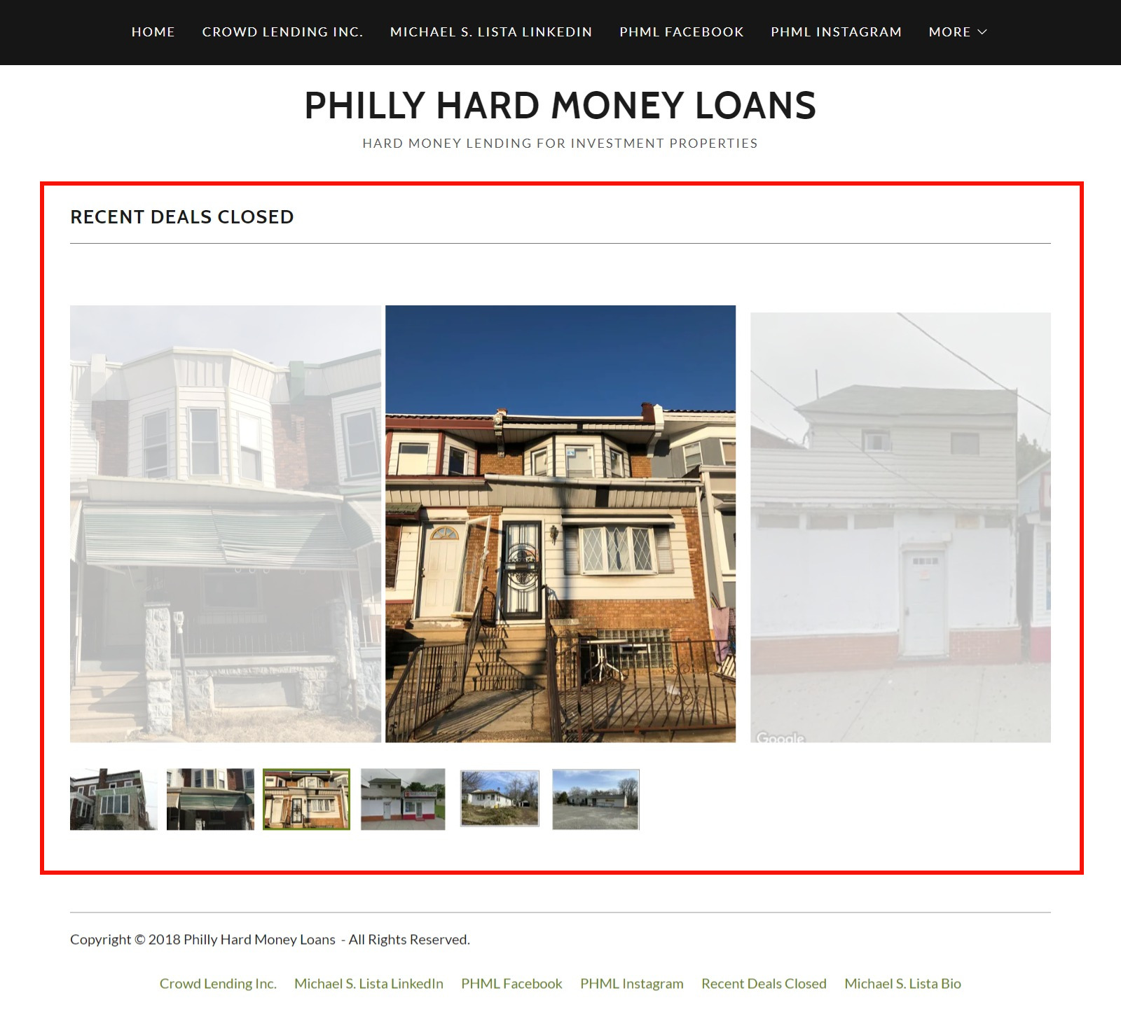
Portfolio Page
Similar to the state of my own work, this client’s ability to find new work of his own depends heavily on his ability to show off work that he’s previously done. Since the properties he works with and their locations are varies, I setup the portfolio page to make it easy for a site visitor to easily go through his past works an target specific items or locations:
Contact Forms
The original site’s front-end contact form was a standard “Name / Email / Message” setup:

I rebuilt the form on a page of its own using my goto of Ninja Forms. An extra option field calling for a phone number was also added. Finally, a mandatory drop-down selection box with a set of pre-defined subjects laid out by the client.

Usually I have these forms send a copy to the client with the selected subject matter in the subject line. This allows the client to easily skim over several submissions from their inbox. This helps them to figure out who needs what without having to immediately dig into each one.
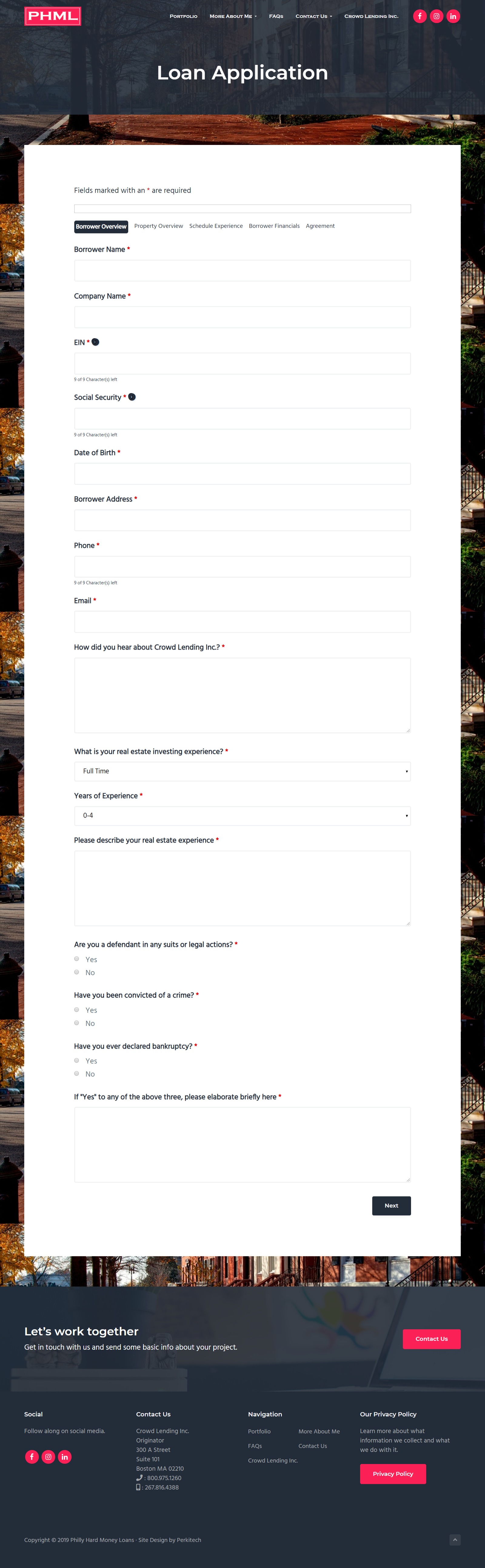
Next, the client mentioned that the site needed to be able to accept full loan applications. He stated that the specific information was laid out in the PDF version below:
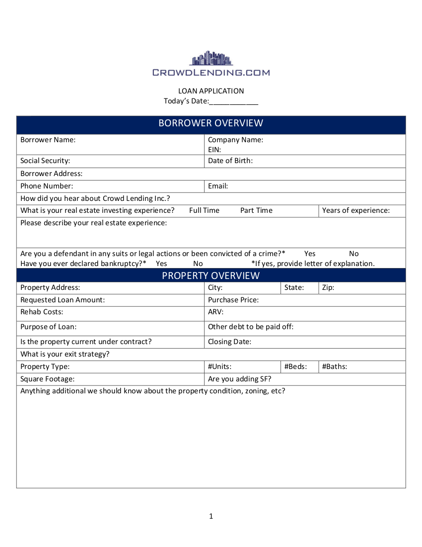
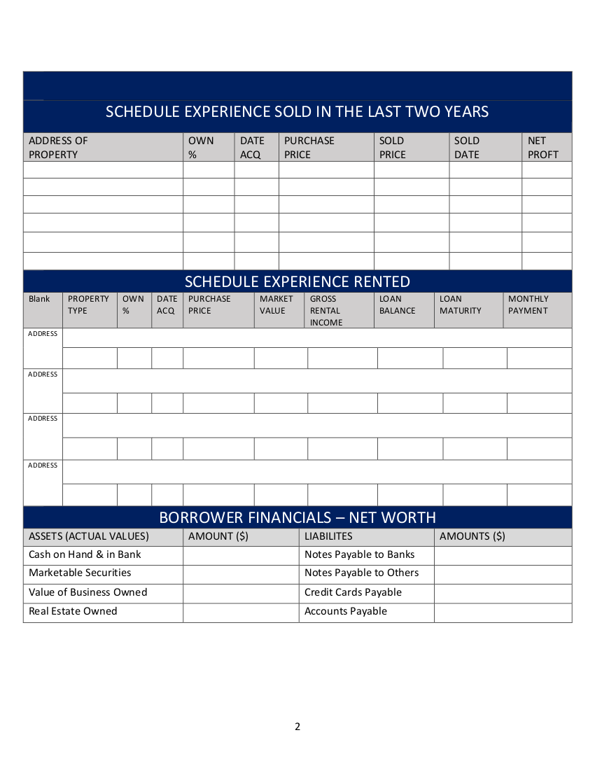
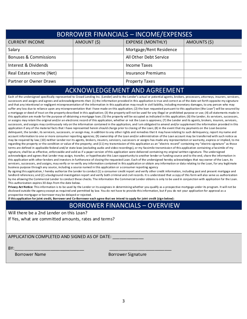
To deal with this request, I implemented one of Ninja Form’s standalone upgrades called Multi-Part Forms. Well worth their current asking price of $49 to ensure that this would be done more properly:

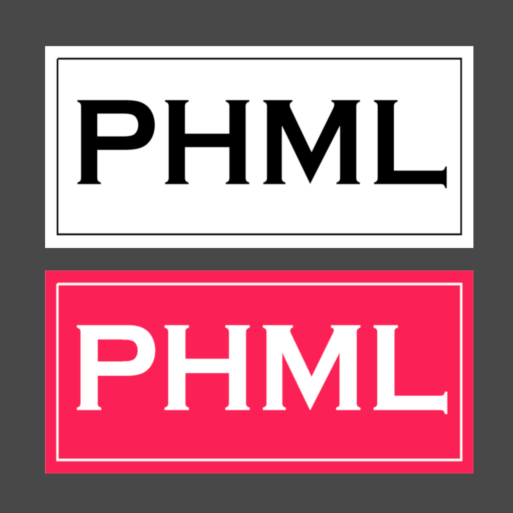
Logo
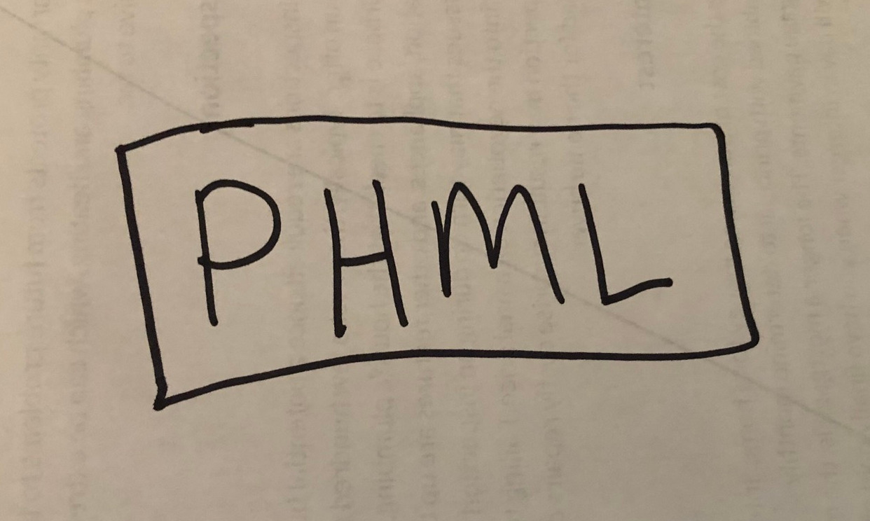
Near the end of the project, the client asked about a logo. Initially, a logo design was not a part of the original brief. However, I agreed to take a crack at it. It gave me an opportunity to start flexing some of my logo design muscles in a real-world scenario.
Below is a rough sketch of what the client was looking for:
This is a B&W and Color layout of what I came up with:
In addition, a square variant was made to serve as his site’s favicon:
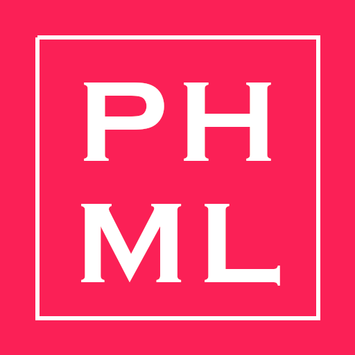
The specific shade of red – Radical Red – was chosen to match the highlights of the rest of the site.
In hindsight, I realized that I never asked the client if the slight waves in his sketch were meant to be incorporated into the actual design. That’s something I will make sure to be more mindful of for the next brief. Above all, he was pleased with how it all came out.
Below is the guide that I provided the client with:

Soon after preparing this, I learned that I should have given him a few other types of file formats. For instance, he received both logos in JPG, PNG, and PDF variants. Apparently, there are about three others he should have received. In addition, the logo guide should have some more technical information about the logo and its usage. In conclusion, I decided that I would openly speak to those errors here instead of running back to fix them. Having said errors to reference here will keep me more mindful of correcting it for future clients.
A Bit About The Backend
In this part, I will talk about some things that were done in the backend and on platforms that are auxiliary to the site itself.
To address the SEO ranking concerns, I setup the site with Yoast SEO:
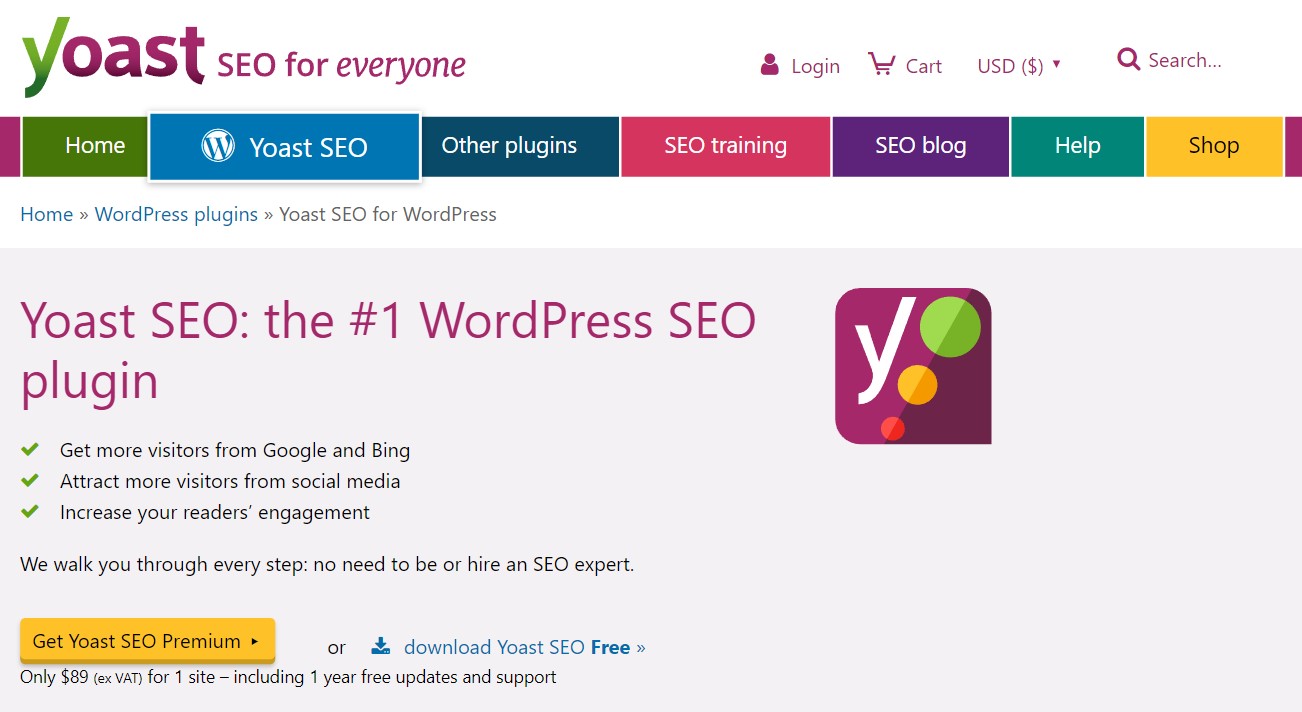
This plugin makes it very easy to get up to speed with at least best-practices as far as SEO. Also, the premium option also allows for the modification of meta tags, robot.txt files, and the like.
Afterwards, I setup the client with a Business Page and a Search account to really make sure that the automated crawlers at SkyNet Google were aware of his site’s existence.
The specific sites are as follows:
- Google My Business – https://www.google.com/business/
- Google Search Console – https://search.google.com/search-console/about
I setup these systems and then gave them a week to spin their wheels. Afterwards, I started to search for the company’s name and its primary subject matter in Google. This is what I found:
-
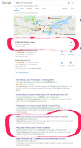
- Search: “Philly Hard Money Loans”
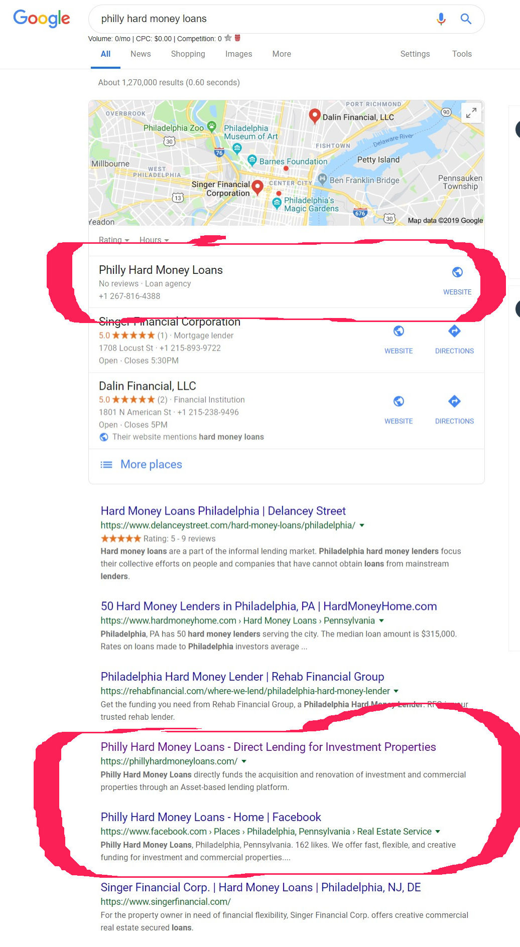
-

- Search: “Hard Money”

Finished Product
Here is a shot of the finished site:
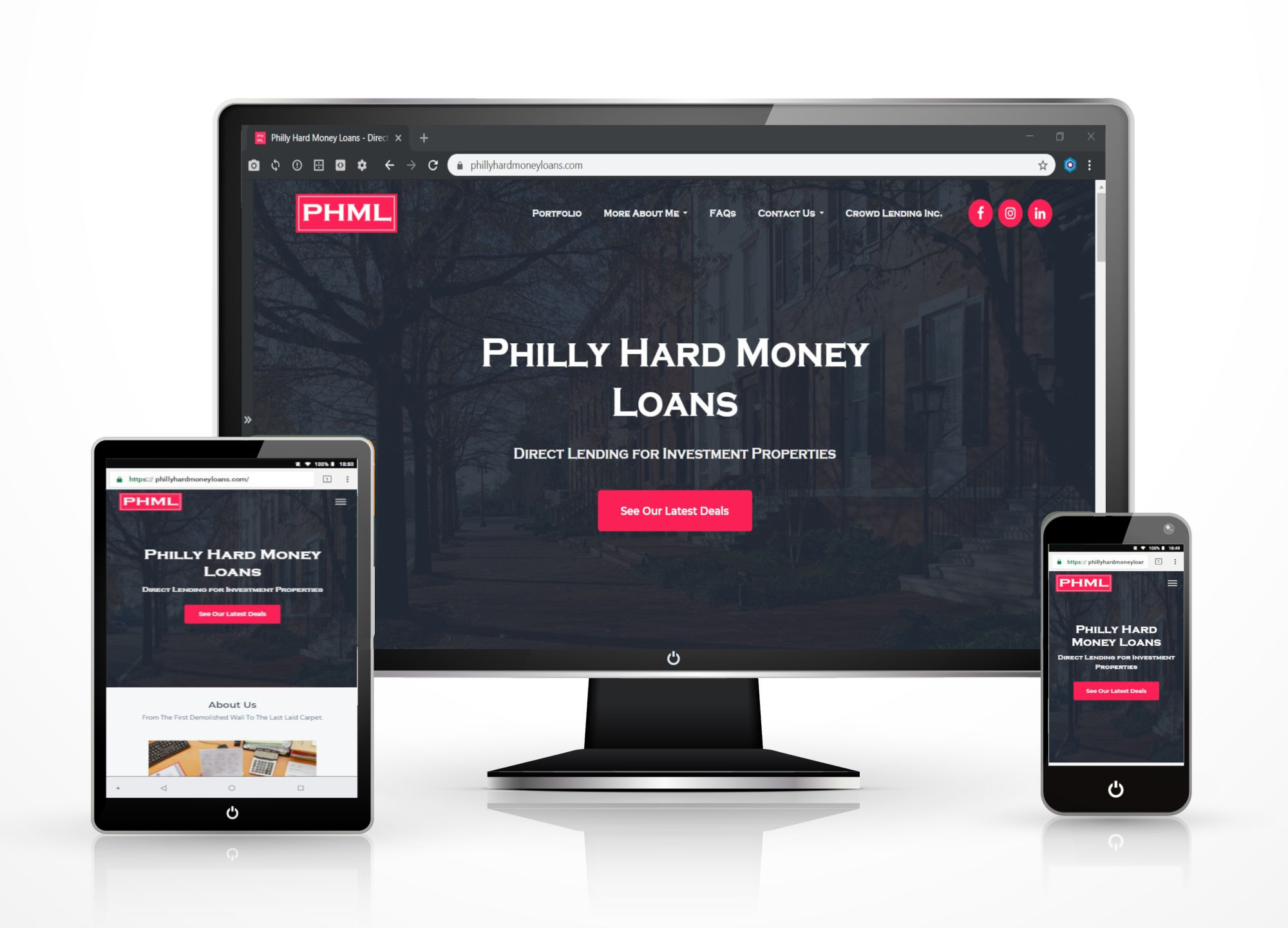
The Finished Work
In conclusion, I don’t know what else to say at this point except that I was happy to be given the chance to help the client out with this one. Furthermore, I’m glad that he was pleased with the results. In addition, if you the reader have anything to say about what else I could have did to have made this case study better – things that I should have added in or maybe left out – leave a comment below or send me a message.
Thanks for reading.
Very thorough planning and completion of the work I presented. I could not be happier. You nailed it. You have definitely helped me build my brand more efficiently. Throughout the process, you kept me updated on your progress and were always quick to respond to my emails with questions about the site and your process, as well as my personal edits. My site is now professional and an effective marketing tool to borrowers. Impressive. Thank you for the work.